• About Me
    • Power BI with Me Blog

Power BI with Me

  • The Iterator Edition

    November 1st, 2023

    By Audrey Gerred

    Let’s talk about some DAX functions! More specifically, I want to unravel the difference between iterator DAX functions and their regular counterparts. Admittedly, this is something that I didn’t get the importance of right away. It’s a bit like comparing apples to oranges, but both are delicious in their own way.

    First Things First: DAX Functions

    DAX (Data Analysis Expressions) is the language used in Power BI (Power Query uses M code, i.e. Mash-Up). It has a wide array of functions to perform calculations, aggregations, and transformations. Some functions are pretty straightforward – you give them a column of data, and they return a single value.

    What the Heck are Iterator Functions?

    Then, there are these special ones called iterator functions. They’re like wizards in the world of DAX. Instead of dealing with the whole column at once, they work their magic row by row, giving you the power to iterate (i.e. doing it again and again – see, row by row) through your data.

    AVERAGEX vs. AVERAGE: The Showdown

    Let’s take an example to understand the difference between iterator functions and regular functions, and when to use which.

    Scenario: Daily Sales Data

    You have a dataset with daily sales data, and you want to calculate the average sales amount. Now, you could use the AVERAGE function, and it would work just fine. It takes the whole column of sales amounts and gives you the average.

    Average Sales = AVERAGE(SalesTable[SalesAmount])

    The Twist: Monthly Average

    But here’s the twist: What if you want to calculate the average monthly sales, and your data is in a detailed daily format? AVERAGE alone won’t cut it because it would give you an average of all the daily values. You need a monthly breakdown.

    AVERAGEX to the Rescue!

    This is where AVERAGEX comes into play. It’s an iterator function. Instead of taking the entire column in one go, it works through each row and then calculates the average. So, it goes through each row to do the summing, then averaging the sums.

    Average Monthly Sales = AVERAGEX(SalesTable, SalesTable[SalesAmount])

    Here’s the key: by using AVERAGEX, you’re able to iterate through the daily data and calculate the monthly average. It’s like having a mini AVERAGE function for each month, and then you’re getting the average of those monthly averages. This makes your calculation precise and granular, exactly what you need for monthly insights.

    Conclusion: Choose the Right Tool for the Job

    The takeaway here is simple: choose the right tool for the job. When you need a quick, straightforward average, use AVERAGE. But when you need to dive into the details, perform calculations row by row, and get more granular results, that’s where AVERAGEX and its iterator friends come in handy.

    The next time you’re faced with a data challenge, remember that DAX has a toolkit with functions that cater to your specific needs. Choose wisely, and you’ll be the magician of your data analysis!

    Here’s a Microsoft Learning path that can help you dig in further: Use DAX iterator functions in Power BI Desktop models – Training | Microsoft Learn

  • My ADHD Edition

    October 26th, 2023

    By Audrey Gerred

    I’ve been thinking about writing this blog for quite a while and going back and forth on whether I should take the plunge. Why? Because there’s a very personal aspect to it. I finally decided to just do it, I’m sharing my ‘dirty laundry’.

    Today, let’s dive into a conversation that’s close to my heart – learning Power BI when you’re not only passionate about analytics but also navigating the ADHD highway/roller-coaster. If you’re juggling between the thrilling world of data and the constant dance of distraction, I’ve got some tips to make your Power BI learning adventure not only manageable but truly exciting.

    1. Ride the Wave of Your Passion

    First things first – let your passion be your guiding star. When you’re genuinely excited about something, it becomes easier to stay engaged. Think of Power BI as a gateway to transforming your data-driven dreams into reality.

    2. Harness Hyperfocus for Deep Dives

    ADHD often comes with the gift of hyperfocus. Use this to your advantage. When you’re in the zone, dive deep into a specific Power BI topic or project. It’s amazing how much you can accomplish when you’re on fire!

    3. Interactive Learning is the Key

    Sitting through lengthy lectures or reading dense manuals might not be your jam. So, make learning interactive. Power BI is all about interactivity, so get your hands dirty! Build reports, create dashboards, and see your data come to life. There’s nothing like immediate results to keep you hooked.

    4. Embrace Creative Visualization

    Your analytical mind probably thrives on creativity. Power BI is a playground for creative data visualization. Use it as an opportunity to express yourself. Turn your data into stunning visuals that not only convey insights but also ignite your passion.

    5. Chunk Your Learning

    ADHD often prefers bite-sized chunks. Break your Power BI learning journey into manageable pieces. Spend a day on data modeling, another on DAX calculations, and so on. It’s like savoring your favorite meal one bite at a time.

    6. Practice Mindful Learning

    Mindfulness techniques can help. Before you start learning, take a moment to clear your mind, focus on the task at hand, and breathe. This helps reduce distractions and improve concentration.

    7. Leverage Online Communities

    Power BI has a vibrant community. Join forums, participate in webinars, and explore Power BI-themed subreddits. Connecting with like-minded folks not only fosters your passion but can also be a source of motivation.

    8. Set Realistic Goals

    Set achievable learning goals. It’s better to master one aspect of Power BI at a time than to overwhelm yourself with too many goals. Celebrate your achievements along the way.

    9. Organize Your Learning Environment

    An organized learning environment is your ADHD brain’s best friend. Keep a dedicated space for your Power BI adventures and use tools to stay organized. Digital apps can be a lifesaver.

    10. Never Underestimate the Power of Patience

    Lastly, remember that your learning journey is your own. Don’t rush it. Power BI is an amazing tool (not just a viz tool – it’s so much more than that), and mastering it takes time. Your passion will drive you forward, and the process itself can be incredibly rewarding.

    So there you have it, my friends. Learning Power BI with ADHD is not just a challenge; it’s an opportunity to leverage your unique strengths and channel your passion into the world of data. Let’s keep the conversation going, share our experiences, and celebrate our analytical adventures together.

    Keep fueling that passion and keep those insights coming!

  • The Explicit/Implicit Measure Edition

    October 25th, 2023

    By Audrey Gerred

    Have you ever delved into the world of Power BI and found yourself standing at the crossroads of a crucial decision: explicit measures vs. implicit measures? If you’re scratching your head thinking, “What’s the difference, and why does it even matter?” – well, you’re not alone. But today, I’m here to break it down for you.

    Explicit Measures: The Clarity Champions

    Imagine explicit measures as the clear and detailed storytellers of your data. They’re like friends who explain everything step by step. When you create an explicit measure, you explicitly define the formula it uses. You get to name it, specify how it should behave, format it, add descriptions to make it understandable for everyone, and utilize them in Analyze in Excel and or other viz tools when you connect to a Power BI semantic model with XMLA endpoints.

    The beauty of explicit measures is that they offer precision. If you need a calculated field that counts something specific or performs a unique calculation, you can create it as an explicit measure. This helps you ensure consistency and reliability across your reports. It’s like having a well-annotated map for your data journey.

    Implicit Measures: The Quick & Dirty Hack

    Now, let’s chat about implicit measures. These are more like your speedy friends who can give you a quick answer but might not explain how they got there. In Power BI, implicit measures are created automatically when you drag and drop fields onto visuals. They save you time by providing basic aggregation (like sum or count) without you writing a single line of code.

    Implicit measures are fantastic for speedy report creation or quick exploratory data analysis. However, they come with a trade-off – they might not always give you the exact results you desire, especially for complex calculations and you can’t use them in Analyze in Excel or when visualizing in another tool through XMLA endpoints. They can also become confusing when dealing with multiple visuals and changing requirements.

    So, What’s the Best Choice?

    Here’s the deal: there’s no one-size-fits-all answer. Both explicit and implicit measures have their place in the Power BI toolkit.

    • Use explicit measures when:
      • You need precise and custom calculations
      • Clarity and documentation are vital for your reports
      • You want to create KPIs or unique metrics
      • Ease of use for users with Build Access
      • Utilizing in Analyze in Excel and or other viz tools through XMLA endpoints
    • Use implicit measures when:
      • You’re in the early stages of report development
      • You need a quick answer for basic analysis
      • You’re exploring data on the fly

    In an ideal world, a balanced mix of both can work wonders. You can start with implicit measures for initial data exploration and report sketching. Then, as your report matures and specific requirements arise, shift to explicit measures for those custom calculations and crystal-clear explanations.

    Think of it like a conversation – sometimes you need a quick answer, and sometimes you need a detailed discussion. In Power BI, explicit and implicit measures give you the flexibility to do just that. So, go ahead, use both wisely, and tell your data story with confidence!

    What’s your take on the explicit vs. implicit measures debate in Power BI? Share your thoughts in the comments below!

  • The Separation Edition

    October 17th, 2023

    By Audrey Gerred

    When it comes to working with Power BI, there’s this little nugget of wisdom that I’ve come to swear by – the importance of keeping your datasets and reports in separate .pbix files. It might sound like an extra step, but trust me, it’s a game-changer, and I’ll tell you exactly why.

    Picture this: you’ve spent days, maybe even weeks, crafting the perfect dataset. You’ve cleaned your data, created relationships, and even added calculated columns and measures to make it sing. It’s like the foundation of your data world, rock-solid and ready to roll.

    Now, here’s where the magic starts. You create a brand new .pbix file with a live connection to the dataset and call it your “Report” file. In that file, you’re building the most stunning visuals, crafting engaging dashboards, and weaving your data into a compelling story. It’s where the real magic happens.

    But why separate the two? Well, let’s talk it through.

    #1: Teamwork and Collaboration: Imagine you’re not alone in this data adventure. You’re working with a team. When your dataset and reports live separately, you can have multiple people working on different aspects simultaneously. One team member focuses on the dataset, while another dives into report creation. No stepping on each other’s toes, no version control nightmares – it’s a harmonious dance of data.

    #2: Version Control: Oh, version control! It’s a beautiful concept. When your dataset and report are in separate .pbix files, you can manage and track changes with precision. If you need to update the dataset, you won’t mess up your finely tuned report, and vice versa. It’s like having a safety net for your precious data.

    #3: Reusability: Let’s not forget the sheer reusability factor. Once you’ve built a rock-solid dataset, you can use it across various reports. It’s like having a treasure chest of data gold that you can draw from whenever you need. No need to recreate the wheel each time.

    #4: Performance and Efficiency: Separation can boost performance. Smaller files are more efficient to work with. When your dataset is separate, your report loads faster and operates more smoothly, especially when dealing with large datasets.

    Now, don’t get me wrong; there are situations where having everything in one .pbix file makes sense. For small projects or personal use, it’s convenient. But when you’re dealing with serious data projects, collaboration, and efficiency, this separation strategy is golden.

    So, there you have it – the magic of keeping datasets and reports apart in Power BI. It’s like maintaining a tidy kitchen and creating culinary wonders separately; it’s more efficient, collaborative, and less likely to end up in a recipe disaster. And once you give it a try, you might just find it hard to go back to the old way. Data management, after all, is all about making things easier and more efficient, and this separation strategy does just that.

  • The DAX Variables Edition

    October 4th, 2023

    By Audrey Gerred

    Data Analysis Expressions (DAX) is the backbone of Power BI’s analytical capabilities. It empowers us to create complex calculations and metrics, transforming raw data into actionable insights. One of the lesser-known gems within the world of DAX is the use of variables. In this blog post, we’ll explore how harnessing the power of variables can significantly enhance your Power BI modeling and analysis.

    What Are DAX Variables?

    Before we dive into the benefits, let’s understand what DAX variables are. Basically, variables in DAX allow you to store intermediate results or values within a formula. These stored values can be reused multiple times within the same calculation, making your expressions more efficient, readable, and maintainable.

    Improved Readability

    One of the immediate advantages of using variables in DAX is improved readability. DAX formulas can become intricate and convoluted, especially when dealing with complex calculations. By using variables, you can break down these complex expressions into smaller, more manageable parts. This makes your formulas more intuitive and easier to understand, not only for you but also for others who may need to work with your Power BI model.

    Consider a scenario where you’re calculating a complicated financial metric involving multiple sub-calculations. Without variables, your formula might resemble a labyrinthine equation. With variables, you can assign names to these sub-calculations, making it crystal clear what each part of the formula does.

    Enhanced Performance

    Efficiency is another compelling reason to embrace DAX variables. When you use variables, DAX evaluates the expression assigned to the variable only once, storing the result for subsequent use. This can lead to significant performance improvements, especially when dealing with large datasets or complex calculations.

    Imagine a situation where you’re repeatedly calculating the same subtotals or aggregations in various parts of your report. Without variables, DAX would calculate these values multiple times, potentially slowing down your report. With variables, you compute the value once and reuse it wherever needed, reducing unnecessary recalculations and improving report responsiveness.

    Debugging Made Easier

    Debugging DAX formulas can be challenging, especially when you have long and intricate expressions. Variables come to the rescue once again. When you encounter an issue in your formula, you can inspect the values of intermediate variables to pinpoint the problem area. This can save you a considerable amount of time in identifying and resolving errors.

    By using variables effectively, you create a modular structure within your DAX calculations. This modular approach simplifies the troubleshooting process, as you can isolate and test individual parts of the formula without altering the entire expression.

    Enhanced Reusability

    DAX variables promote reusability. Once you’ve defined a variable, you can use it across multiple measures or calculations within your Power BI report. This not only saves you time but also ensures consistency in your analysis. If a business requirement changes, you can update the variable in one place, and the change will automatically propagate throughout your report, reducing the risk of errors.

    Conclusion

    In the world of Power BI and DAX, variables are a powerful tool that can streamline your modeling and analysis processes. They enhance readability, improve performance, simplify debugging, and promote reusability. By incorporating variables into your DAX toolbox, you can take your Power BI reports and dashboards to the next level, providing clearer insights and more efficient data analysis. Don’t underestimate the potential of DAX variables—they might just become your secret weapon for unlocking the true power of Power BI.

    Link to Microsoft Documentation: Use variables to improve your DAX formulas – DAX | Microsoft Learn

  • The Query Folding Edition

    September 21st, 2023

    By Audrey Gerred

    When it comes to data transformation and manipulation in Power BI, the Power Query editor is your go-to tool. It offers a wide range of options and functions to shape your data into a format that’s ready for analysis and visualization. Among the many features that make Power Query a powerful ETL (Extract, Transform, Load) tool, one stands out as a game-changer for performance optimization: Query Folding.

    Query Folding is a concept that can significantly enhance the efficiency and speed of your data transformations in Power Query. To truly understand its impact, let’s dive into what Query Folding is and why it’s essential in your Power BI workflow.

    Query Folding is the art of delegating data transformation tasks back to the data source. Instead of Power Query laboriously processing every transformation step, it lets the data source do the heavy lifting. This means that your database or data repository carries out the transformations, significantly boosting performance and efficiency.

    As an analogy, imagine you’re hosting a dinner party and need a delicious three-course meal. You could either do all the cooking yourself, from shopping for ingredients to chopping, seasoning, and cooking each dish, or you could hire a talented chef.

    In the first scenario, you’d spend hours in the kitchen, working tirelessly to prepare the meal. This is similar to how Power Query without Query Folding operates—it loads all your data into its workspace and meticulously processes each transformation step locally, like you cooking each dish from scratch.

    On the other hand, hiring a chef represents Query Folding. Instead of doing everything on your own, you delegate the complex cooking tasks to a professional. The chef (or your data source, in the case of Query Folding) knows exactly how to prepare each dish efficiently, with access to the best equipment and expertise. This allows you to focus on other aspects of your dinner party, much like your data source efficiently handling data transformations while you concentrate on data analysis and visualization in Power BI.

    In other words, Query Folding is like having a skilled chef take care of the cooking, saving you time and effort, while ensuring a more efficient and optimized outcome. Similarly, it allows your data source to perform data transformations, resulting in faster query execution and smoother data analysis in Power BI.

    Why Query Folding Matters

    1. Turbocharged Performance: The most evident benefit of Query Folding is its power to supercharge your data transformation process. By tapping into the data source’s processing capabilities, your queries execute faster, making your reports and dashboards more responsive.
    2. Minimal Data Transfer: Query Folding minimizes the amount of data transferred between Power Query and the data source. This reduction in data transfer is a lifesaver, especially when dealing with large datasets or working across slower network connections.
    3. Optimized Query Plans: Data sources like databases are optimized for data manipulation. Query Folding ensures that these sources generate optimal query execution plans, leading to more efficient and faster transformations.
    4. Scalability: As your data grows, Query Folding keeps you ahead of the game. By offloading work to the data source, you can handle larger datasets without straining your resources.

    How to Leverage Query Folding

    To leverage the power of Query Folding in Power BI Power Query, follow these best practices:

    1. Use Native Queries: Whenever possible, opt for native queries when connecting to your data source. This allows Power Query to delegate as much of the work as possible to the source system.
    2. Minimize Data Import: Avoid importing unnecessary data into Power Query. Filter and aggregate data at the source level to reduce the volume of data transferred.
    3. Understand Query Dependencies: Be aware of the limitations and capabilities of your data source. Not all data sources support Query Folding for every transformation type, so understanding these limitations is crucial.
    4. Check Query Execution Plans: Use tools like the Query Diagnostics feature in Power BI to analyze query execution plans. This can help you identify opportunities for Query Folding and performance optimization.

    In conclusion, Query Folding is a powerful feature in Power BI Power Query that can significantly enhance your data transformation and query performance. By pushing as much of the data transformation process as possible back to the data source, you can enjoy faster refresh times, reduced data transfer, and improved scalability. To make the most of Query Folding, it’s essential to understand your data source, choose native queries, and regularly analyze query execution plans. With these practices in place, you’ll unlock the true potential of Power Query in Power BI.

  • The ‘Fabric for Power BI Users’ Edition

    September 12th, 2023

    By Audrey Gerred

    In my previous blog post, I covered how you can get a free trial version of Fabric through a Microsoft Developer Account so that you can start doing some hands-on tutorials. Today, I completed the tutorial, “Fabric for Power BI Users” and, I am hooked! In this blog post, we’ll walk you through the key steps covered in this comprehensive tutorial and highlight how it can empower you to harness the full potential of your data… all in one workspace!

    Creating Your Lakehouse Microsoft Fabric Lakehouse is a versatile data architecture platform designed for the centralized storage, management, and analysis of both structured and unstructured data. This scalable solution empowers organizations to efficiently handle extensive data volumes while leveraging a variety of tools and frameworks for data processing and analysis. It seamlessly integrates with other data management and analytics tools, offering a holistic solution for data engineering and analytics needs.

    Data Transformation with Dataflows Gen2 Data preparation and transformation are essential for meaningful insights. Dataflows Gen2 is the new generation of dataflows which has new features and an improved experience such as shorter authoring flow, auto-save and background publishing, data destinations, improved monitoring and refresh history, integration with data pipelines, and high-scale compute.

    Adding Data Destinations Data must find its home. In this section, you’ll add data destinations (nice new Gen2 feature), ensuring your transformed data has a place to reside. Configuration options are available to suit your specific needs, whether it’s replacing existing data or appending new records.

    Orchestrating with Data Pipelines Automation is key! Pipelines are a powerful feature of Azure Data Factory that enable you to create and automate data-driven workflows in the cloud. Pipelines allow you to logically group and manage ETL activities instead of managing each individually.

    Semantic Modeling At this point, you’re in the home stretch! Now, let’s make sense of your data. In this section you will utilize the SQL endpoint to create relationships between tables (you know Power BI loves those Star Schema models) and SQL views in the lakehouse. This allows you to easily access the data within the semantic model which is designed to present data for analysis according to the structure of the business.

    Crafting DAX Measures Power BI’s DAX language empowers you to calculate meaningful metrics. In this section you’ll create a simple measure, but feel free to practice making more!

    Creating SQL Views SQL views are your gateway to structured data access. You’ll craft SQL statements to calculate total sales amounts by month, saving them as views for future reference.

    Auto-create a Report Time to visualize your data! Power BI’s auto-create report feature generates a dynamic report based on your data model. You’ll save, edit, and customize this report to meet your reporting needs.

    By following these steps outlined in the tutorial, you’ll be one step closer to understanding and leveraging everything that Fabric has to offer. So, don’t hesitate – dive into the tutorial, create your data lakehouse, and let the data-driven journey begin.

  • Getting Started with Fabric Edition

    September 7th, 2023

    By Audrey Gerred

    Fabric, Fabric, Fabric… unless you are living under a rock, you have undoubtedly heard a ton of news about Microsoft unveiling Fabric in Power BI. Fabric (still in preview) is an end-to-end analytics product that brings together the best of Power BI, Azure Data Factory, and Azure Synapse into a unified lake-centric SaaS platform.   Such big changes can be overwhelming, and you may be wondering where to start or if/how you can test it out and get more comfortable with it. Fear not! Today, we’ll just dive on in and get you some access to start your learning journey!

    Microsoft has several tutorials that allow you to jump in and start hands-on learning. They have both multi-experience and experience-specific tutorials. The most important piece of the puzzle when starting one of these tutorials is having a tenant with Fabric enabled. You may have access through your organization, but if you don’t, you can sign up for a Microsoft 365 Developer Account. With the Microsoft 365 Developer Program you will get access to a sandbox and a free, renewable 90-day Microsoft 365 E5 developer subscription which is pre-provisioned with M365 apps.

    To sign up for an M365 Developer Account, you will need a personal Microsoft Account (i.e. @outlook.com or @hotmail.com) which you can easily set up here, if you don’t already have one.

    Once you have your personal Microsoft account set up, you will need to set up your M365 Developer Account, which you can do here (I suggest using an InPrivate window), then clicking the ‘Join Now’ button.

    When you see the below screen fill in the Country/Region, Company (enter your own name if you are not using this on behalf of your organization), language preference, accept the terms and conditions, then click Next.

    Select Personal projects, then click Next.

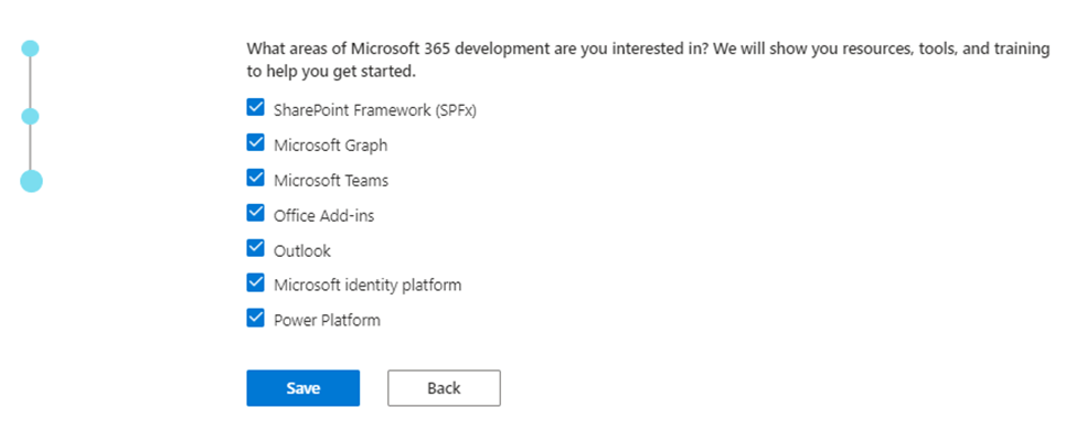
    Select which areas you are interested in, then click Save.

    Select Configurable sandbox, then click Next.

    Create a username, domain, and password, then click Continue.

    Enter your phone number, then click Send Code.

    Once you get the code you can enter it, then click Set up and you will be taken to a screen that shows how many days you have left and other information.

    Now, swing on over to Power BI Service and login using the credentials for your Developer Account (in my example it was powerbiwithme@powerbiwithme.onmicrosoft.com). Power BI should appear as it always does… for now.

    Click the settings icon in the upper right-hand of your screen.

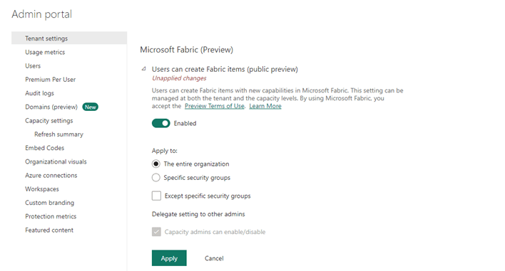
    Select Admin portal, then in Tenant settings, go to Microsoft Fabric (Preview), enable, and apply.

    It will take about 15 minutes for the changes to take effect. Once they do, you will notice a Power BI icon in the lower left-hand side of your screen. If you click on it, you will see additional options available to you because of Fabric being enabled in the tenant.

    When you need to create a Fabric Capacity Workspace, select Trial under the Advanced options.

    Viola! Now, that you have enabled Fabric you can start utilizing the Microsoft tutorials! Happy learning!

  • The Hybrid Table Edition

    August 25th, 2023

    Have you ever found yourself wrestling with massive datasets and the need for real-time insights? Well, hold onto your hats because we’re about to dive into the game-changing benefits of using an incremental refresh hybrid table in Power BI, and trust me, it’s a total game-changer (not as big of a game changer as Fabric will be, but still… a game changer you can implement immediately)!

    The Perfect Blend: Import and DirectQuery

    Picture this: you’ve got a hefty dataset that’s just too large to fit comfortably into Power BI’s memory. What’s the solution? Enter the incremental refresh hybrid table! This approach combines the speed and full array of DAX that you get from Import mode with the real-time allure of DirectQuery. Translation? You get the best of both worlds.

    Speed, Meet Real-Time Insights

    Have you ever wished for real-time insights without compromising speed? Incremental refresh hybrid tables grant your wish. By partitioning your data and loading only what’s necessary into Import mode, you’re avoiding those pesky memory constraints. That means lightning-fast calculations and transformations. Meanwhile, DirectQuery mode keeps you up to date with real-time changes.

    Master Complexity, Embrace Flexibility

    We get it—large datasets can be as complex as a Rubik’s Cube. Incremental refresh hybrid tables let you slice and dice your data into manageable pieces based on your criteria. It’s like solving that puzzle effortlessly! And guess what? This granularity eases refresh management and reduces those dreaded refresh failures.

    Smart Storage, Brilliant Performance

    Your data isn’t one-size-fits-all, and neither should your storage strategy be. With hybrid tables, historical data chills in Import mode, while DirectQuery mode keeps recent data sizzling hot. This dynamic duo optimizes both storage and performance, giving you more bang for your storage buck.

    Scale Up, Not Out

    As your dataset grows, so does your headache, right? Wrong! Incremental refresh hybrid tables scale like a champ. Add new partitions as your data expands, maintaining peak performance and ensuring that your insights remain as fresh without suffering the latency and reduced DAX ability with a pure DirectQuery model.

    Accurate Reports, Happy Users

    When your reports are powered by an incremental refresh hybrid table, you’re not just dealing with data—you’re wielding insights like a pro. The blend of real-time data and lightning-fast calculated values creates reports that sing true and resonate with users. Talk about making an impact!

    In a Nutshell…

    Using an incremental refresh hybrid table in Power BI is like having your cake and eating it too. You’re breaking through the limitations of traditional data handling, embracing real-time insights, and keeping your performance on point. It’s a journey that’s all about balance, speed, and flexibility—a journey worth taking. So, go ahead, transform your data game with an incremental refresh hybrid table, and let the Power BI magic unfold!

    For more details, constraints (hint: your data source needs to support query folding), and instructions check out Reza Rad’s tutorial: Incremental Refresh and Hybrid tables in Power BI: Load Changes Only – RADACAD

  • The Calculation Group Edition

    August 10th, 2023

    In my last blog post we discussed utilizing Field Parameters to give report-users more control over how they slice the data in reports. This is a great feature that works with dimension type fields for slicing data, but what about letting the report-user decide which measures they see in the visual – decide which data to slice? Sure, you can do it with SWITCH() in DAX, but there is a better way! Today, we’ll explore calculation groups and Tabular Editor 2.

    Tabular Editor 2.x is a free, open-source tool where you can manipulate and manage measures, calculated columns, create calculation groups etc. Once installed, you will see an additional tab on the ribbon of Power BI desktop called External Tools. If you have other external tools (DAX Studio, Bravo, Split PBIX file, etc.) installed you will already have this tab.

    Calculation Groups are groupings of measures which reduce the number of explicit measures needed by utilizing DAX to automate repetitive measures (i.e. time-intelligence measures like LY, YoY, YoY%, MTD, YTD). Talk about a huge time-savings! Even if you eventually do need the explicit measures down the road, the speed in which you can get countless iterative measures done in minutes is a huge bonus when you need to get a POC or some data exploration done quickly (and for creating reports where the user gets to the data they need with a few slicers).

    For our example, we will start off with the below model used to create the below matrix and slicer. In this report, the report-user can decide what Row Variable to slice Sales and Sales YoY% by, but they cannot choose to see what the Sales for last year, QTD, YTD, etc. are, nor can they decide if they would like to look at any metric besides Sales.

    To create a calculation group, open your model in Power BI Desktop, click the External Tools tab, then click Tabular Editor.

    Tabular Editor will open.

    First, we will create a calculation group to handle Time-Intelligence measures.

    • Right click on Tables, hover on Create New, and click on Calculation Group
    • Name the Calculation Group Time-Intelligence Calculation Group
    • To create a Calculation Item for This Year (TY), right click on the Calculation Group you just created, hover on Create New, and click on Calculation Item
    • Click in Name and enter a Name for your item, then click into Format String Expression and enter how you would like to display the data, then click into the Expression Editor and type SELECTEDMEASURE() and click the check mark
    • Next, we will add a Last Year (LY) Calculation Item – simply repeat the above steps starting with right clicking on Time-Intelligence Calculation Group
    • Click in Name and enter a Name for your item, then click into Format String Expression and enter how you would like to display the data, then click into the Expression Editor and type CALCULATE (SELECTEDMEASURE(), SAMEPERIODLASTYEAR ( ‘Date’[Date] ))
      • You can also choose to have the DAX Formatter format your DAX and long or short line (the picture below is short line)
    • Continue adding as many Time-Intelligence type measures as you would like
    • When you are ready to test them out in Power BI, click the Save icon which will push the changes to Power BI Desktop
    • Go back to your pbix file, if prompted click Refresh
    • Add a slicer to your canvas, open the Time-Intelligence Calculation table
    • Add the Name field to the slicer
    • For the Matrix table, add Field Parameters in the Rows, add Name from the Time-Intelligence Calculation Group table to Columns, and Sales to Value

    Now your report-user can pick and choose which Time-Intelligence metrics they would like to see Sales by and how they slice this data.

    But, wait, there’s more!! I told ya we could give the report-user even more capabilities to decide what to look at, right? Now let’s give them the ability to decide which metric to apply the time-intelligence to.

    Go back to Tabular Editor and create a new Calculation Group – this time, we’ll name it Base Metrics. We are going to create items for Sales which is dollars and Units which is quantity.

    • For Sales, name the item Sales and type [Sales] in the Expression Editor, then click the check mark
    • Repeat for [Units]
    • Save changes to push to pbix file
    • Add a slicer to your canvas and add Name from Base Metrics Calculation Group
    • No changes are needed to the matrix viz we started earlier – we can leave [Sales] in Values because the Base Metric Calculation Group we created will swap it out to [Units] when selected through the slicer

    In the below picture, notice [Sales] is still in Values for the matrix, but because Units is selected in the Base Metric slicer, units are displayed in the matrix (pretty cool!!).

    Now, off you go – go make a report-user very happy with the added functionality! For more detailed instructions here are some great resources:

    Creating Calculation Groups in Power BI Desktop – SQLBI

    Create calculation groups – Training | Microsoft Learn

    And, the best DAX book ever – The Definitive Guide to DAX – 2nd Edition – SQLBI

←Previous Page
1 2 3 4
Next Page→

Blog at WordPress.com.


Loading Comments...
 

    • Subscribe Subscribed
      • Power BI with Me
      • Already have a WordPress.com account? Log in now.
      • Power BI with Me
      • Subscribe Subscribed
      • Sign up
      • Log in
      • Report this content
      • View site in Reader
      • Manage subscriptions
      • Collapse this bar