In my last blog post we discussed utilizing Field Parameters to give report-users more control over how they slice the data in reports. This is a great feature that works with dimension type fields for slicing data, but what about letting the report-user decide which measures they see in the visual – decide which data to slice? Sure, you can do it with SWITCH() in DAX, but there is a better way! Today, we’ll explore calculation groups and Tabular Editor 2.
Tabular Editor 2.x is a free, open-source tool where you can manipulate and manage measures, calculated columns, create calculation groups etc. Once installed, you will see an additional tab on the ribbon of Power BI desktop called External Tools. If you have other external tools (DAX Studio, Bravo, Split PBIX file, etc.) installed you will already have this tab.
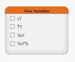
Calculation Groups are groupings of measures which reduce the number of explicit measures needed by utilizing DAX to automate repetitive measures (i.e. time-intelligence measures like LY, YoY, YoY%, MTD, YTD). Talk about a huge time-savings! Even if you eventually do need the explicit measures down the road, the speed in which you can get countless iterative measures done in minutes is a huge bonus when you need to get a POC or some data exploration done quickly (and for creating reports where the user gets to the data they need with a few slicers).
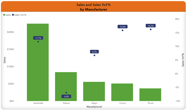
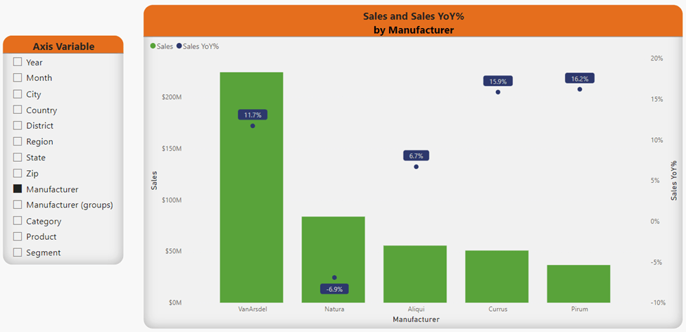
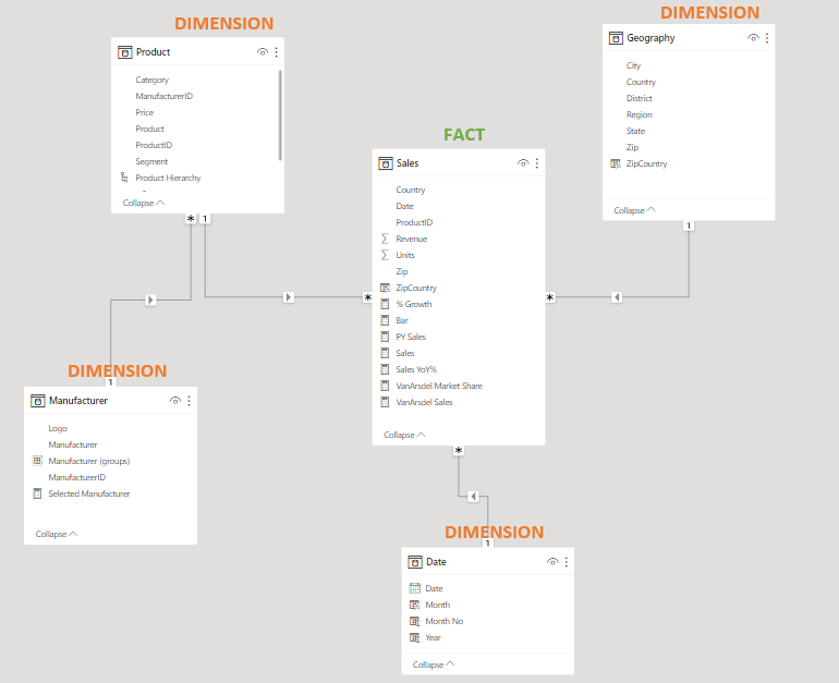
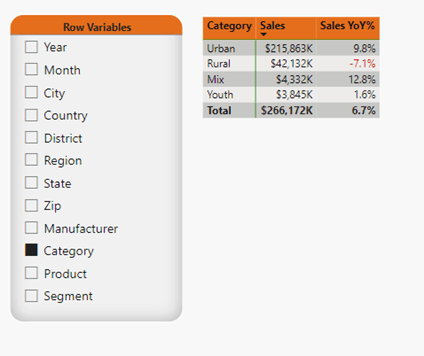
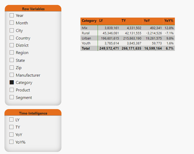
For our example, we will start off with the below model used to create the below matrix and slicer. In this report, the report-user can decide what Row Variable to slice Sales and Sales YoY% by, but they cannot choose to see what the Sales for last year, QTD, YTD, etc. are, nor can they decide if they would like to look at any metric besides Sales.
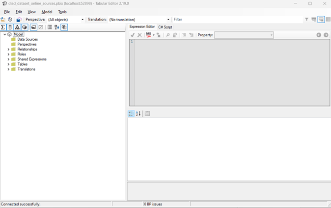
To create a calculation group, open your model in Power BI Desktop, click the External Tools tab, then click Tabular Editor.

Tabular Editor will open.
First, we will create a calculation group to handle Time-Intelligence measures.
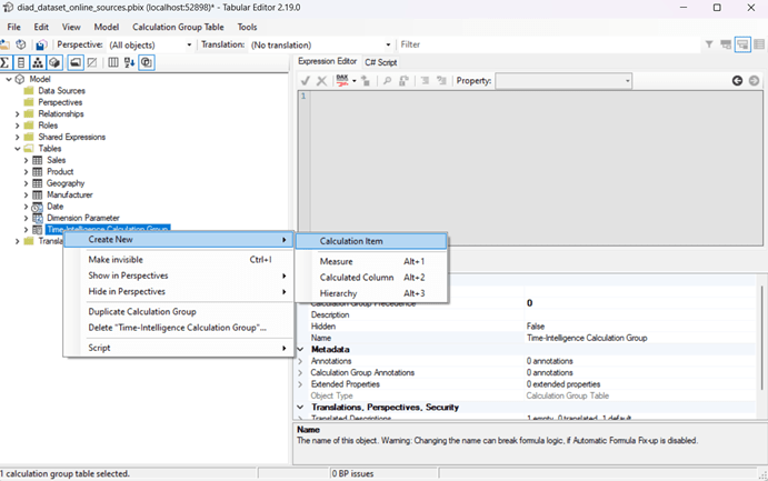
- Right click on Tables, hover on Create New, and click on Calculation Group

- Name the Calculation Group Time-Intelligence Calculation Group
- To create a Calculation Item for This Year (TY), right click on the Calculation Group you just created, hover on Create New, and click on Calculation Item
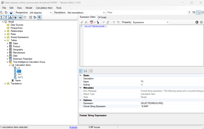
- Click in Name and enter a Name for your item, then click into Format String Expression and enter how you would like to display the data, then click into the Expression Editor and type SELECTEDMEASURE() and click the check mark
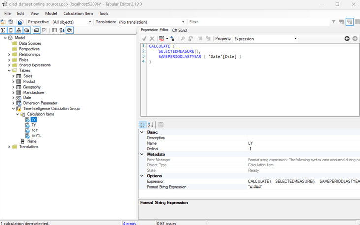
- Next, we will add a Last Year (LY) Calculation Item – simply repeat the above steps starting with right clicking on Time-Intelligence Calculation Group
- Click in Name and enter a Name for your item, then click into Format String Expression and enter how you would like to display the data, then click into the Expression Editor and type CALCULATE (SELECTEDMEASURE(), SAMEPERIODLASTYEAR ( ‘Date’[Date] ))
- You can also choose to have the DAX Formatter format your DAX and long or short line (the picture below is short line)
- Continue adding as many Time-Intelligence type measures as you would like
- When you are ready to test them out in Power BI, click the Save icon which will push the changes to Power BI Desktop
- Go back to your pbix file, if prompted click Refresh

- Add a slicer to your canvas, open the Time-Intelligence Calculation table
- Add the Name field to the slicer
- For the Matrix table, add Field Parameters in the Rows, add Name from the Time-Intelligence Calculation Group table to Columns, and Sales to Value
Now your report-user can pick and choose which Time-Intelligence metrics they would like to see Sales by and how they slice this data.

But, wait, there’s more!! I told ya we could give the report-user even more capabilities to decide what to look at, right? Now let’s give them the ability to decide which metric to apply the time-intelligence to.
Go back to Tabular Editor and create a new Calculation Group – this time, we’ll name it Base Metrics. We are going to create items for Sales which is dollars and Units which is quantity.
- For Sales, name the item Sales and type [Sales] in the Expression Editor, then click the check mark

- Repeat for [Units]
- Save changes to push to pbix file
- Add a slicer to your canvas and add Name from Base Metrics Calculation Group
- No changes are needed to the matrix viz we started earlier – we can leave [Sales] in Values because the Base Metric Calculation Group we created will swap it out to [Units] when selected through the slicer
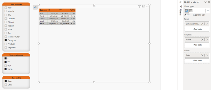
In the below picture, notice [Sales] is still in Values for the matrix, but because Units is selected in the Base Metric slicer, units are displayed in the matrix (pretty cool!!).

Now, off you go – go make a report-user very happy with the added functionality! For more detailed instructions here are some great resources:
Creating Calculation Groups in Power BI Desktop – SQLBI
Create calculation groups – Training | Microsoft Learn
And, the best DAX book ever – The Definitive Guide to DAX – 2nd Edition – SQLBI