By Audrey Gerred
Picture it… it’s any day between July 15, 2015, and March 25, 2022, a day like any other day, and you make a report page that displays Sales and Sales YoY% by Manufacturer (because that’s what you were asked to do), and everyone loves it.
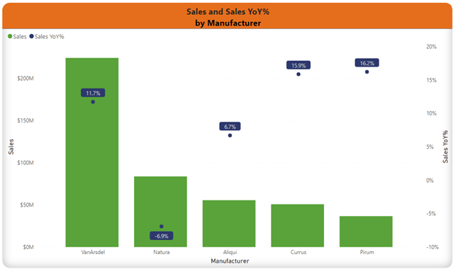
In fact, people like being able to access this information so quickly and easily (one might even say, right at their fingertips anytime of the day or night that they want to look at it) that they start to ask you to show them Sales and Sales YoY % by Category, by Product, by Segment, by Manufacturer and Category, by Segment and Product (and every and any other variation that someone wants and asks for.


The next thing you know, your report has a ton of visuals crammed onto one page, tons of pages that people have to scroll through and (try to) find which combination of variables they want to see the data by, a table of contents with links, and/or bookmarks, drill-throughs (which still have a pre-defined order), separate reports, and don’t even get me started on SWITCH() statements… all in an effort to accommodate the needs of the end consumers (without them having to create their own ad-hoc reports). If the reports aren’t answering the questions that they need answered in order to make their decisions, what’s the point of them?
If you are anything like me, you love when report-users love the access to insights that well-designed Power BI models and reports provide, and they engage and make suggestions for new visualizations and continuous development. But I didn’t love the above-mentioned options for making the process cleaner/faster for different slices of metrics (for the report-user and their experience with the report and for my team’s time maintaining so many pages, bookmarks, links, drill-through, etc.). I wanted the end-user to have more options over controlling how they sliced and diced the measures.
If you’re still doing things any of the previous mentioned ways of giving report-users ‘options’ on how they get to see the slices of data, there is a much better option, and it is very report-user friendly. Drumroll, please… Field Parameters (applause, crowd hoots and hollers… for me finally just getting to the point)!
Thanks to Field Parameters, report-users can dynamically change how the visualizations on a page/report/individual visualization are sliced. Remember all the different visualizations we discussed had to be made before? Check it out now…
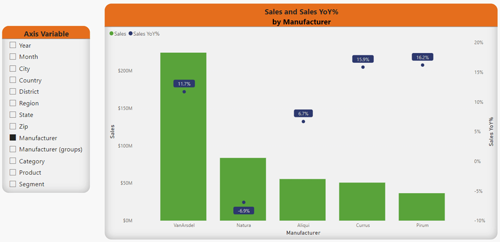
In this example, the report-user would make a selection (or multiple selections) from the Axis Variable slicer on the left-hand side of the canvas. If the report-user would like to see the data at multiple levels in a hierarchy, they simply have to hold Ctrl on their keyboard, click the variables in the order they want them to appear in the visual, then click on the ‘Expand all down one level in the hierarchy’ icon* that appears when they hover on the visual they want to expand.

The next example utilizes the slicer with Field Parameters (named Row Variables), a matrix, and items filtered in the filter pane. The report user decides they initially want to see data for USA and 2021 utilizing the (Filter Pane filter) and slice the data by Category and Segment utilizing the Row Variables slicer.

The report-user can then decide what they would like to dig into further, and simply apply more filters and select the new Row Variables. Viola! Simple!!
I promise, it’s super simple to set-up and update. Just shoot over to Microsoft Learn for detailed instructions! But wait, there’s more! Come back for the next edition where I’ll cover utilizing Tabular Editor 2 to create a calculation group that will allow you to create a slicer to enable the report-user to choose which measures they see in the visuals – giving them even greater opportunities to interact with the data and get actionable insights!